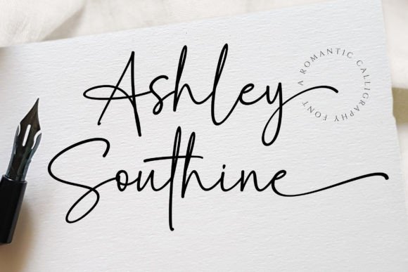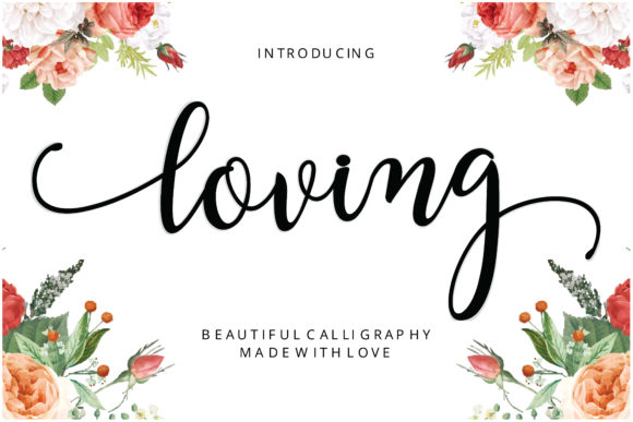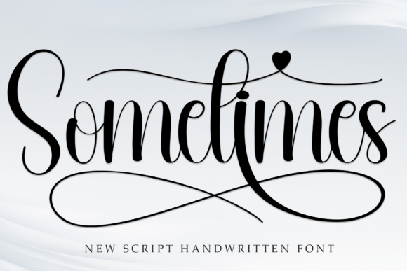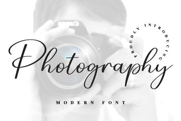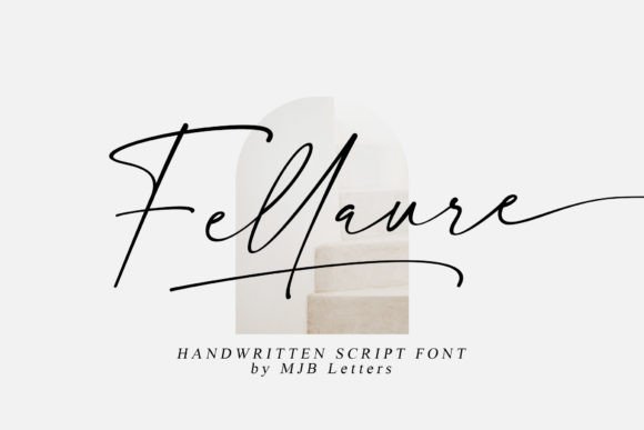
Fellaure is an exquisite handwritten font that balances classic calligraphic influences with a fresh, current feel. It is the font for couples who love tradition but dream in contemporary design, and it thrives in editorial layouts.
The editorial look, explained
Magazine-style stationery relies on contrast: one expressive element surrounded by calm, disciplined type. Fellaure supplies the expression with its calligraphic rhythm, while the rest of the layout stays quiet and precise.
The result feels timeless rather than trendy, because the script nods to tradition while the clean surroundings keep it modern.
A restrained palette and a strict grid
Editorial design is as much about what you leave out. Choose two neutrals and one soft accent, then stay faithful to them across the whole suite.
Align everything to a simple grid: a centered axis for formal invitations, or a left-aligned column for a more modern feel. Consistent margins make even a simple card look considered.
The typography recipe
A reliable formula for a Fellaure suite:
- Names in Fellaure. One line or two, large, with room to breathe.
- Details in a refined serif. Garamond or a similar classic keeps the tone elegant.
- Micro labels in small caps or uppercase. Use them for sections like Ceremony, Reception and RSVP.
Where Fellaure shines beyond the invitation
- Menus: use it for the title and course names only; keep dish descriptions in a serif.
- Ceremony programs: a single Fellaure heading on the cover sets the tone.
- Signage: large format welcome boards show off the stroke contrast beautifully.
- Vow books: a short title on the cover feels personal and refined.
Editorial layout blueprint
- Header labelSmall uppercase, wide tracking, top center.
- NamesFellaure, large, with a hairline rule beneath.
- DetailsSerif at a modest size, short lines, generous leading.
- AccentOne small ornament or monogram in your accent color.
- FooterWebsite or RSVP line, smallest size, ample margin.
Suggested color palette
A palette that flatters Fellaure and keeps the whole suite cohesive:
Design pairing and styling tips
- Pair Fellaure with a refined serif like Garamond for body text.
- Limit your palette to ivory, charcoal and one soft accent such as sage.
- Use whitespace as a design element; resist filling every corner.
- Add a thin hairline rule or a single small ornament instead of heavy borders.
- Keep script to names and titles so it never competes with essential details.
Frequently asked questions
Is Fellaure formal or casual?
It sits between the two. Classic calligraphic influences give it polish, while the contemporary feel keeps it from looking stiff.
Does it work for dark backgrounds?
Yes, in light ink on a deep background, but check that thin strokes remain legible at print size. Increase the size slightly to compensate.
Can I mix it with another script?
It is better to pair it with a serif or sans-serif. Two scripts compete for attention and weaken the hierarchy.