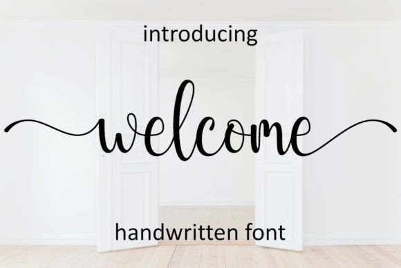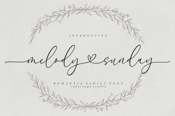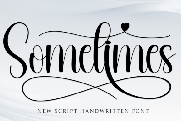
Sometimes is a sweet, fresh and friendly casual handwritten font that brings an approachable vibe to modern wedding layouts. It is a perfect match for relaxed garden parties, picnics and intimate gatherings where warmth matters more than ceremony.
Why casual deserves careful design
A relaxed wedding still benefits from thoughtful typography. The goal is not to be formal but to feel effortless, and effortless always takes a little planning.
Sometimes does the heavy lifting on personality. Your task is to keep sizes, spacing and colors consistent so the friendly look reads as intentional rather than improvised.
The signage plan
Outdoor weddings need clear wayfinding. Sketch your sign list early so every board shares one visual style.
- Welcome sign. The couple's names and the date in large Sometimes lettering.
- Order of the day. A short schedule with times set in a simple sans-serif.
- Seating chart or sign. Guest names in a clean typeface, header in Sometimes.
- Bar and food signs. One or two playful words each, keeping the text brief.
- Directional signs. Arrows with single words for parking, restrooms and ceremony.
Writing friendly copy
A casual font invites casual wording. Short, warm phrases such as find your seat, then find the cake, or grab a drink and say hello, suit the style perfectly.
Keep each sign to a few words so the lettering can be large. People read signs while moving, and brevity is what makes them useful.
Readability from a distance
- Use sentence case or lowercase. Handwritten fonts read best that way.
- Maximize contrast. Dark ink on a light board, or white on deep green, outperforms pastel on pastel.
- Size for the viewing distance. A sign meant to be read from a few steps away needs much larger lettering than a card in hand.
Welcome sign blueprint
- GreetingA short word or two in Sometimes, very large.
- NamesCouple's names in Sometimes, slightly smaller.
- DateSimple sans-serif, widely spaced, one line.
- AccentA sprig of greenery or a small heart as a divider.
- MarginLeave generous border space so the board feels calm.
Suggested color palette
A palette that flatters Sometimes and keeps the whole suite cohesive:
Design pairing and styling tips
- Pair Sometimes with a clean modern sans-serif for schedules and directions.
- Keep headings in the font and all functional information in plain type.
- Use dark, high-contrast ink on light boards so signs read from a distance.
- Limit each sign to a few words and set them large.
- Stay consistent: one font, one palette, one border style across every sign.
Frequently asked questions
Is Sometimes suitable for invitations?
Yes, especially for casual or garden weddings. Use it for names and headings, and put dates and addresses in a clean sans-serif.
What materials work for signage?
Chalkboards, wood, acrylic and printed foam board all work. Whatever you choose, make sure the contrast remains high.
Does it work in all caps?
It reads better in lowercase or sentence case, which keeps the friendly, handwritten feeling.