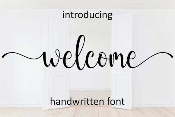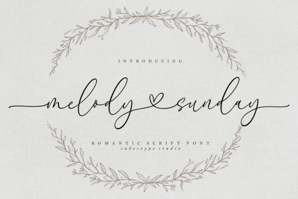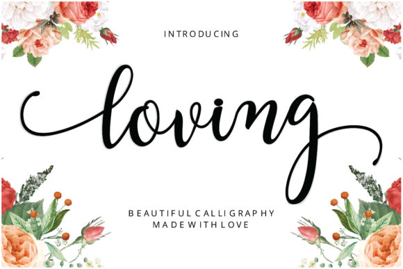
Loving is a beautiful, playful script filled with romantic charm. It adds a whimsical, affectionate touch to wedding stationery, which makes it a natural partner for soft florals. This guide walks you through a complete DIY invitation, start to finish.
Playful script, romantic mood
Not every wedding is a formal gala, and your stationery should say so. Loving brings an easy warmth that suits garden ceremonies, spring celebrations and couples who want their invitations to smile.
Because the lettering carries so much personality, keep the supporting design simple. Florals, soft color and plenty of white space are all it needs.
DIY in five steps
- Choose your size. A 5 x 7 inch portrait card is a classic and easy to print and mail.
- Set the background. Use your own watercolor artwork or a floral graphic you have the right to use, keeping the center calm.
- Place the names. Set Loving large in a dark, high-contrast ink color.
- Add the details. Use a light sans-serif such as Lato in small, centered lines.
- Proof and test. Print one copy at actual size and read it from arm's length before ordering a batch.
Pairing Loving with florals
Florals add color and softness, but they can overpower script when text sits on top of busy areas. Place flowers in corners or along one edge and leave a clear field for the names.
If text must overlap artwork, lighten the artwork or add a soft semi-transparent panel behind the lettering so every stroke stays readable.
Finishing touches
- Gift tags and favor stickers: a single short word in Loving, such as thank you, feels instantly warm.
- Welcome signage: large lettering in deep green or charcoal looks lovely against flowers.
- Envelope details: use it for a return-address flourish or a small label on the back.
DIY invitation blueprint
- Floral frameCorners or one edge only, leaving a calm center.
- NamesLoving, large and centered, dark ink.
- Invitation lineLight sans-serif, small, widely spaced.
- Date and venueTwo or three short centered lines.
- RSVPSmallest size, bottom center, ample margin.
Suggested color palette
A palette that flatters Loving and keeps the whole suite cohesive:
Design pairing and styling tips
- Pair Loving with a light sans-serif so the script remains the star.
- Keep florals in the corners and the text field clear for readability.
- Choose dark ink for names; pale pink script on a pale background will disappear.
- Repeat one flower motif on tags, stickers and signs for a cohesive look.
- Print a test card and check it in natural daylight before the full order.
Frequently asked questions
Is Loving suitable for serious or formal weddings?
It leans playful, so it is best for celebrations that are warm and relaxed. For formal events, use it sparingly for names only and pair it with a classic serif.
What colors suit it best?
Blush, peony pink and leafy green feel natural, but a deep charcoal or navy keeps the names crisp and easy to read.
Can I use it in white on a dark card?
Yes, as long as the strokes remain clearly legible. Increase size slightly and test the print.