Wedding Typography · The Edit
7 Romantic Wedding Fonts for Elegant Invitations
Every bride dreams of stationery that looks as though it came from a boutique letterpress studio, though not every budget agrees. The quiet secret designers rarely share is that wedding invitation typography does most of the heavy lifting. A single graceful script can turn a simple card into something luxurious and deeply personal.
Whether you adore soft, flowing elegant calligraphy or a playful handwritten charm, the right wedding fonts set the mood before a guest reads a single word. Here are seven romantic favorites, each with a styling tip to help you use it beautifully.
Ashley Southine
Some scripts feel designed. Ashley Southine feels written. Its uniquely crafted curves give invitations a warm, refined human touch, as if every name were penned by hand just for your guests. A graceful choice for couples who want elegance without stiffness.
➞ Download Ashley Southine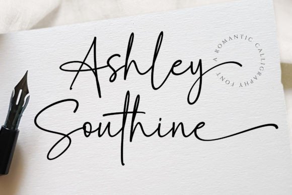
Set the couple's names in Ashley Southine and pair them with a spaced-out uppercase sans-serif such as Helvetica Neue for the date and venue. Keep the script large and let it breathe.
Fellaure
For brides who love tradition but dream in contemporary design. This exquisite handwritten font balances classic calligraphic influences with a fresh, current feel. Use it for the couple's names and watch an ordinary layout turn editorial.
➞ Download Fellaure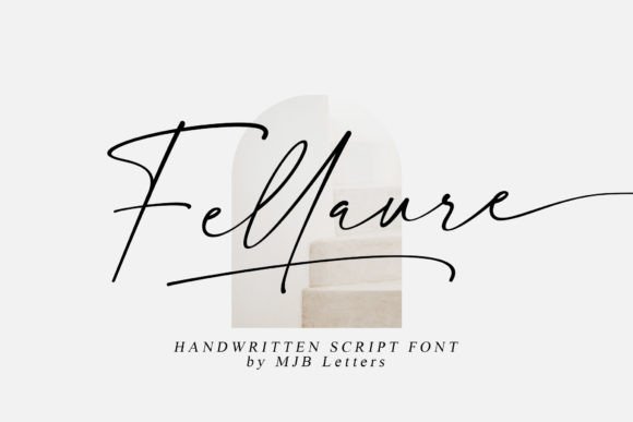
Pair Fellaure with a refined serif like Garamond for the body text, and keep your palette to ivory, charcoal and one soft accent color for a magazine-worthy suite.
Loving
If your wedding is more joyful celebration than formal gala, Loving is made for you. This beautiful, playful script is filled with romantic charm and adds a whimsical, affectionate touch to wedding stationery.
➞ Download Loving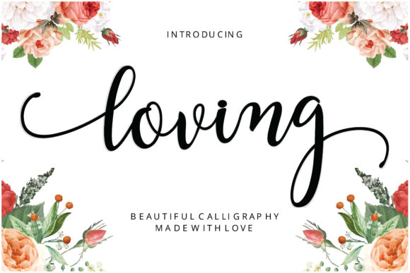
Combine Loving with watercolor florals and soft blush tones. Keep supporting text in a light sans-serif such as Lato so the playful script remains the hero.
Sometimes
Not every invitation needs to whisper. Sometimes is a sweet, fresh and friendly casual handwritten font that brings a lovely, approachable vibe to modern wedding layouts, especially relaxed garden parties and intimate gatherings.
➞ Download Sometimes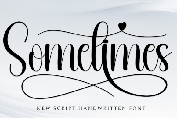
Use Sometimes for welcome signs and itinerary headings, then pair with a clean modern sans-serif for schedules and directions to keep everything easy to scan.
Photography Font
Clean lines, confident strokes, zero fuss. This sleek, modern script excels as a signature watermark, a contemporary brand mark or the star of a stylish minimalist wedding design.
➞ Download Photography Font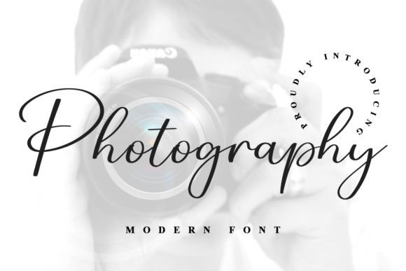
Lean into white space. Pair this script with a thin uppercase sans-serif and a single hairline rule for a gallery-style invitation or a polished watermark.
Welcome
Pure polish. This incredibly elegant, stylish handwritten font looks stunning on thank you cards, quotes and luxurious bridal suite details. Use it for the moments that deserve a little extra sparkle.
➞ Download Welcome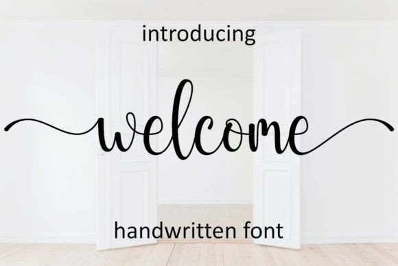
Print Welcome in deep charcoal or warm gold foil on thick cream card stock, and keep supporting lines in a classic serif for a heartfelt, high-end finish.
Melody Sunday
The finishing flourish on this list. A chic, lovely calligraphy font defined by an elegant vibe, distinct character shapes and timeless swashes that make every word feel like a small work of art. Ideal for the main invitation, where first impressions matter most.
➞ Download Melody Sunday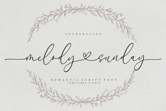
Let the swashes frame the names, and balance them with a small, widely tracked serif in capitals for the details. Avoid adding a second script to the same card.
How to Pair Script Fonts Perfectly
A beautiful script is only half the design. These simple rules keep your stationery elegant and easy to read:
- Use script for the star, not the whole story. Reserve it for names, titles and short phrases.
- Pair with a clean serif or sans-serif for details. Dates, times, addresses and RSVP lines read best in Georgia, Garamond, Montserrat or Lato.
- Never mix two scripts on one card. One script plus one supporting font is the golden rule.
- Mind your spacing. Add generous letter spacing to uppercase text and leave plenty of white space around flowing script.
- Test before you print. Check readability at actual size and at arm's length.
Choose your favorite, pair it with a quiet supporting font, and your invitations will feel like a luxury suite without the luxury price tag.
Disclosure: this page contains affiliate links. If you purchase through them, we may earn a small commission at no extra cost to you.